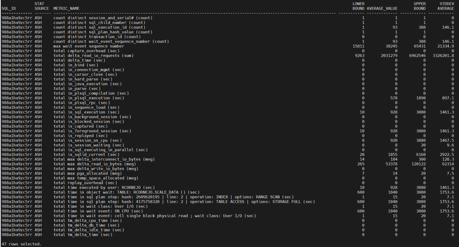
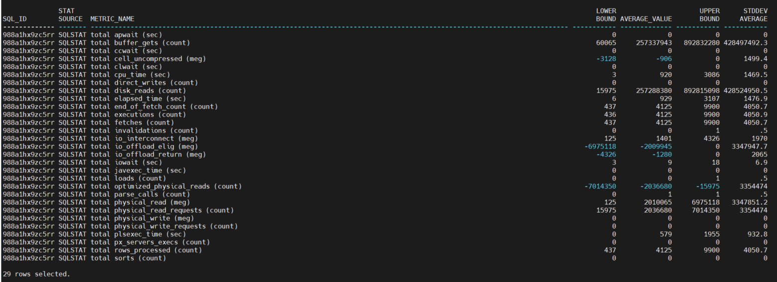
In Part III, I covered details on the Normal Ranges, but left out the screenshots (and discussion) on running the normal_ranges sub-query.
The screenshots below are the output of running the simple select (above) on the normal_ranges with clause sub-query [subset into two sets of output, one on stat_source = ASH and another on stat_source = SQLSTAT, for my convenience taking the screenshots].
There are nearly 50 features engineered from the active session history and nearly 30 from the SQL statistics at this time [as you may recall, I plan to go back and re-jig some of the feature engineering].
A few things to note on the numeric columns – the values are computed for each metric across all snapshots (and ASH samples) from the normal interval date/time range specified for this run of the code:
· Lower Bound: this is the lower bound of the normal range.
· Average Value: this is the average value of the metric.
· Upper Bound: this is the lower bound of the normal range.
· Standard Deviation: this is the square root of the variance, which is basically another measure of the degree of dispersion in the data. When the standard deviation is low, then the metric values are close to the average. When the standard deviation is high, then the values for that metric are much more widely dispersed.
So, again, these normal ranges are used to flag anomalies in metric values that come from the problem interval. As previously stated, the feature selection [i.e. reducing the set of relevant features] method I use a form of one-hot encoding: assigning a 1 of the value is above the normal range and a zero if it is below the normal range. After that, it’s a simple query to report the flagged metrics and their values and order by the metrics with the most anomalies, and how far off from normal the values they were [to be covered in a future post].
Hopefully you can see that by unpivoting the columns into rows and using other feature engineering techniques, I can easily scale my analysis to many metrics. With ASH and SQLSTAT there are not as many metrics compared to the tens of thousands found in other database instance wide metrics embedded in many AWR views, but still there are about 80 metrics instrumented thus far, and it would be very difficult to do column-by-column comparisons when using the pivoted multi-column-table version of the AWR views. The intent of the DOPA approach is to make the root cause analysis of a problem easier by showing you only the metrics and their values that are outside of normal range, thus providing that laser focus on the performance issue at hand.


